Vintage Seltzer
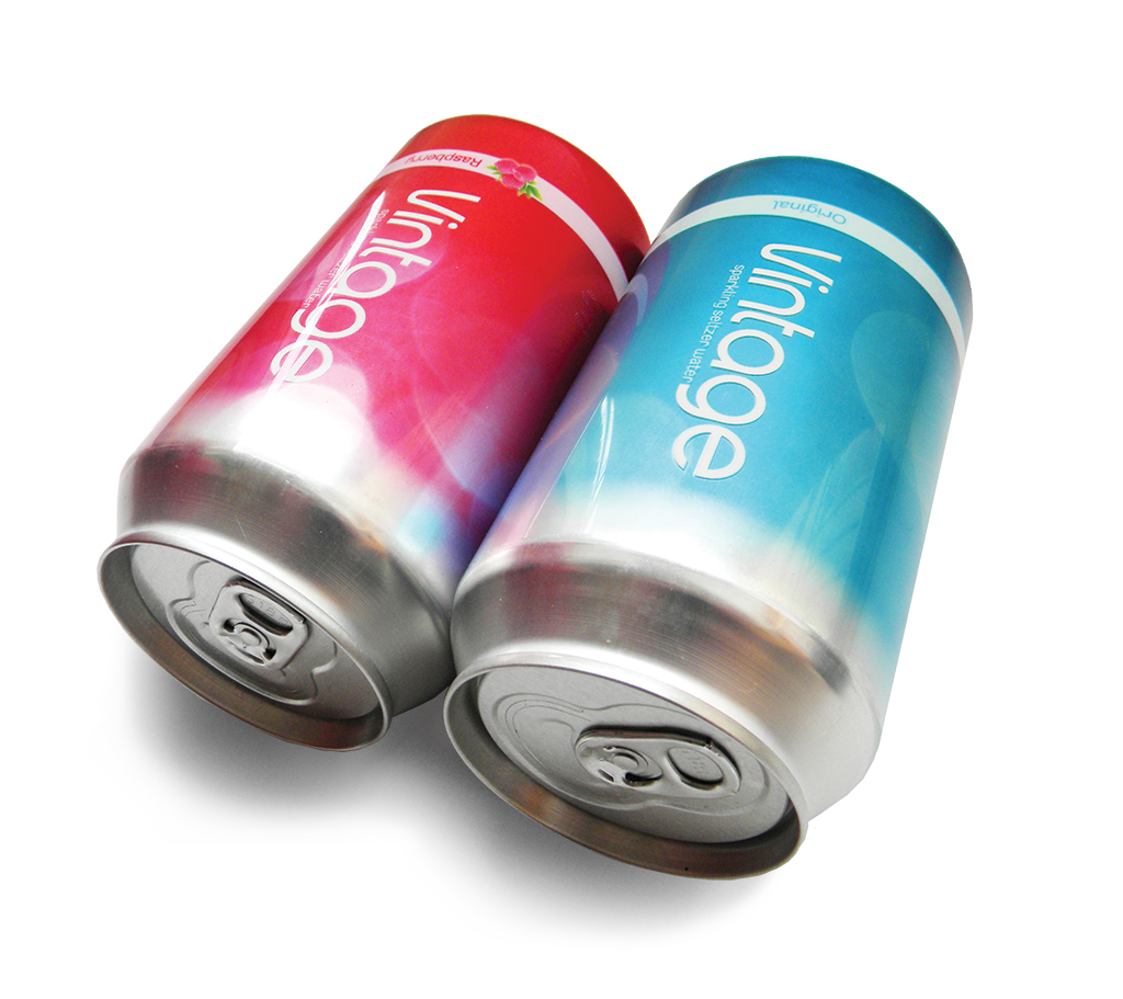
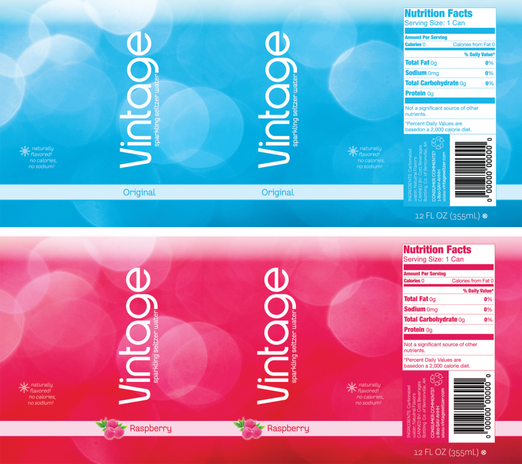
These cans were part of a class project to redesign the cans for original and raspberry flavored Vintage seltzer water. A challenge in this assignment was to come up with a design that could be adapted for a variety of flavors while focusing on the technical and legal requirements of food packaging.
Instead of a literal interpretation of the brand name, I chose to juxtapose the name with a modern, clean design that was more suggestive of what was inside. The bubble texture brings to mind the carbonation of the seltzer water. The darker coloring at the bottom of the can gives way to the natural color of the can at the top, mimicking the rise of carbonation after a soda is poured into a glass. The placement of “sparkling seltzer water” in the logo lockup is meant to connote the flow of water.
Instead of a literal interpretation of the brand name, I chose to juxtapose the name with a modern, clean design that was more suggestive of what was inside. The bubble texture brings to mind the carbonation of the seltzer water. The darker coloring at the bottom of the can gives way to the natural color of the can at the top, mimicking the rise of carbonation after a soda is poured into a glass. The placement of “sparkling seltzer water” in the logo lockup is meant to connote the flow of water.


