Kleenex
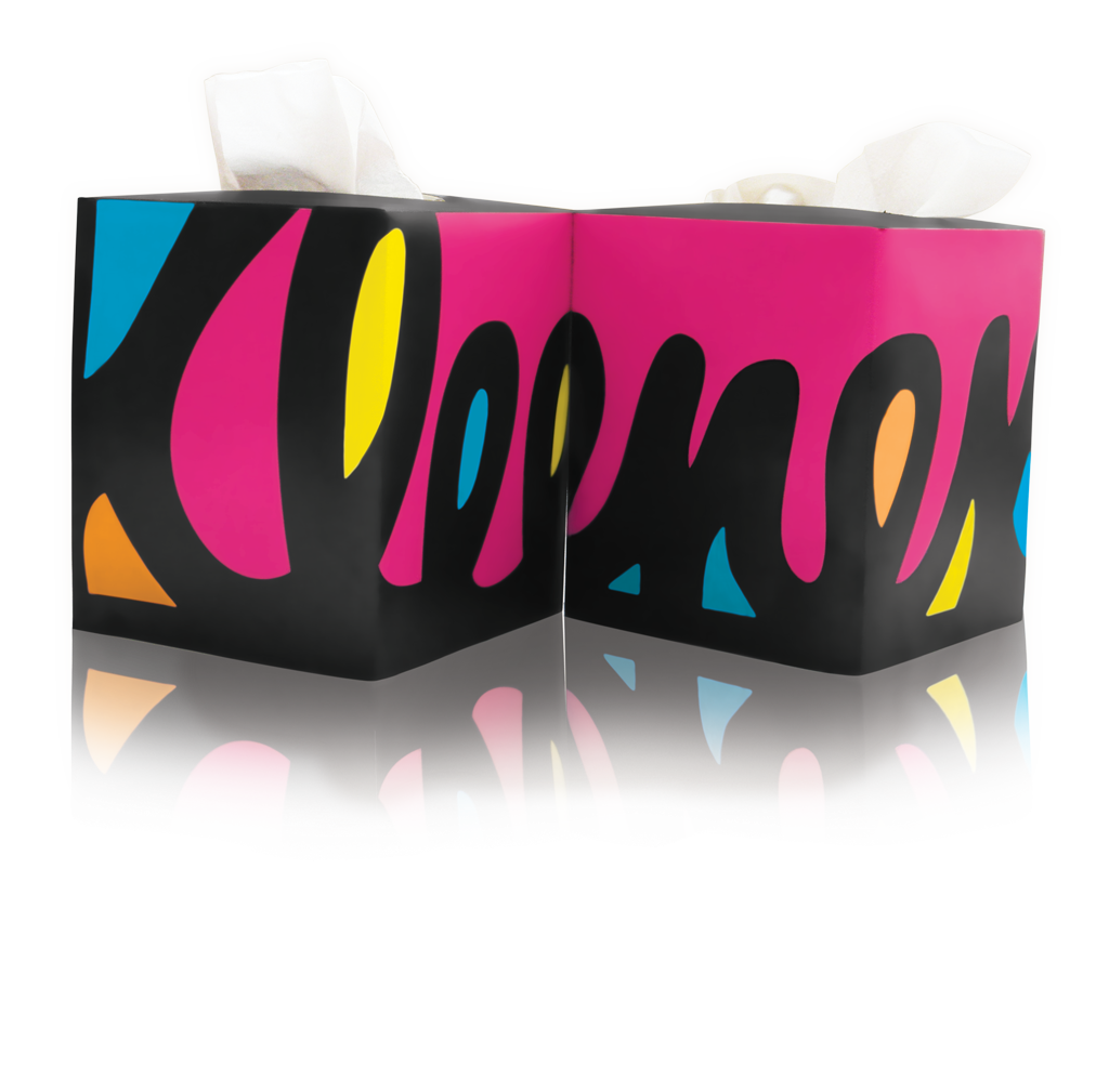
This was an assignment to redesign the Kleenex box with a modern twist. The box was supposed to be a part of a 4-pack, designed with shelf appeal in mind. I used the Kleenex logo, which will read on the shelf as a part of a 4-pack, but also becomes more abstract when one box is placed in the home.


